
|
 265 K |
Didbin, Thomas Frognall, 1776-1847. The bibliographical decameron London, Printed for the author, by W. Bulmer and co., Shakespeare press, 1817. 3 v. illus., plates (1 double) ports., facsims. (1 fold.) 26 cm. Bulmer, William, 1757-1830, printer. 010 D544b |
| The first decades of the 19th century witnessed the development of mechanization and mass production in printing: papermaking machines, stereotyping, steam-powered cylinder presses, and case binding in cloth-covered boards. Didbin's Decameron by Bulmer stands out as an exquisitely produced book in the tradition of fine printing and a landmark in the literature of the history of the book. | |
43 K |
Burns, Robert, 1759-1796. The poetical works of Robert Burns. London, W. Pickering, 1839. 3 v. front. (port.) 17 cm. The Aldine edition of the British poets "London: Printed by C. Whittingham, Tooks Court"--Vol. 1, p. 264. Pickering, William, 1796-1854, publisher. Whittingham, Charles, 1795-1876, printer. 821.6 B967 1839 |
| In 1828, Pickering adopted the Aldus printer's device with the motto "Aldi Discip. Anglvs" or "English Disciple of Aldus." A publisher, not a printer, he developed an early and lasting relationship with Charles Whittingham, proprietor of the Chiswick Press. His various Aldine Editions were well-produced, popular, and relatively inexpensive. Pickering was the first to fully separate the function of book designer from publisher or printer. | |
210 K |
Dickens, Charles, 1812-1870. A tale of two cities / by Charles Dickens; with illustrations by H. K. Browne. London : Chapman and Hall, 1859. viii, 254 p., <16> p. of plates : ill. ; 23 cm. (8vo) The first edition complete in one volume. Originally published in 'All the year round,' and issued concurrently in eight monthly parts. Browne, Hablot Knight, 1815-1882, illustrator. Chapman and Hall, publishers. PR4571 .A1 1859 |
| Dickens was notoriously particular in the scrutiny of proofs before his books were printed. His publisher, Chapman and Hall, one of the largest London houses, obliged their best-selling author. Despite this attention to the proper rendering of the text and securing the services the immensely popular book illustrator Browne, the printed page lacks elegance. It has a dense appearance with the spikey thick and thin typeface not allowing the eye an easy transit across the page. | |
 136 K |
MacKellar, Thomas, 1812-1899. The American printer : a manual of typography, containing complete instructions for beginners, as well as practical directions for managing every department of a printing office. 7th ed. Philadelphia : MacKellar, Smiths & Jordan, 1872, c1866. 336 p. : ill. ; 20 cm. 655.2 M154a 1872 |
| This manual, thorough to the point of advising apprentices on the substance of their character, contains surprisingly little on typefaces. However, MacKellar advises, "... a book should be printed in a style of elegance severe and unadorned ..." and complains about the interference of publishers in matters of typography. | |
 92 K |
Browning, Robert, 1812-1889. Jocoseria, by Robert Browning. London, Smith, Elder, & co. ... 1883... 7 p. l. [7]-143 [1] p., 2 ˘. 18 cm. 821.8 B885j |
| Smith, Elder was a large publisher with a reputation for the quality and popularity of its authors. It produced a number of attractive small format volumes. This first edition does show attention to the layout of the page and the use of a more rounded fluid type. However, the effect is still mechanical and cold and the use of a small font does not resolve the awkwardness of the layout in the small format. For comparison, the small format Bodoni imprints with the very cold typeface, possess a presence that is lacking in this volume. | |
 295 K |
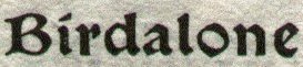
Morris, William, 1834-1896. The water of the Wondrous Isles. Hammersmith, Kelmscott Press, 1897. 340 p. 29 cm. Kelmscott Press, printer. PR5079 .W3 1897 |
| Morris, with his vast distaste for the separation of the worker from the work by the machine, took up the production of books late in life. Among his other extensive accomplishments, he was a talented and knowledgeable calligrapher with a deep appreciation for illuminated medieval manuscripts. This particular volume, published a year after his death, is a fine example of Morris's sense of type design and the illustrated page. The Kelmscott Press is the locus of the modern fine press movement.
For more Kelmscott Press material see: |
|
| 15th Century | 16th Century | 17th Century | 18th Century | 19th Century | 20th Century | Home |